At long last, a typeface designed specifically for low vision readers


Modern medicine has turned low vision into a public health paradox: While blindness is declining worldwide, more people are growing old enough to lose their vision.
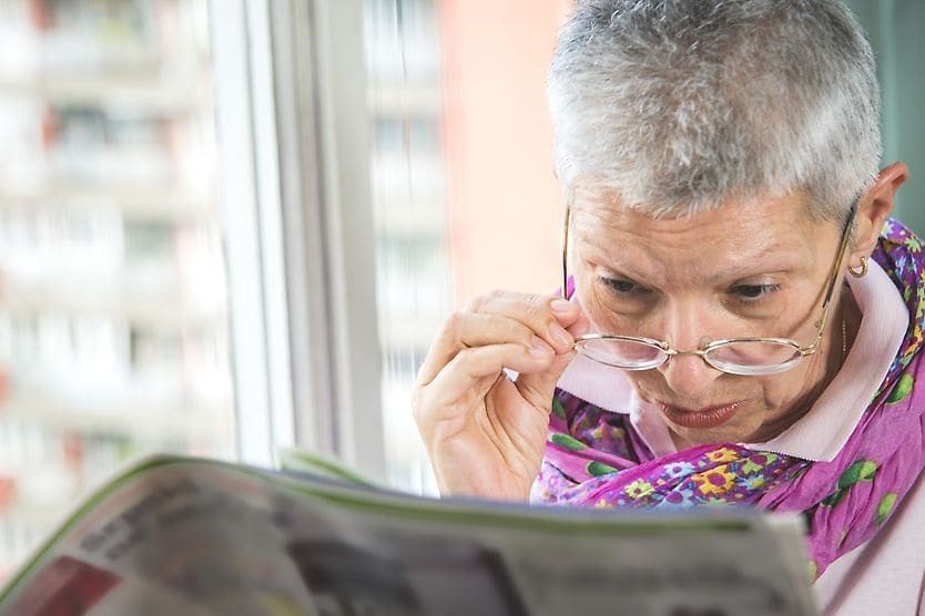
Therefore, an aging population may pose a mounting low-vision challenge — especially when it comes to reading text set in type. Typefaces can define the shape of text, making it legible enough for many readers while creating difficulties for some people whose low vision can’t be corrected.
That could change with the arrival of a new typeface developed jointly by the Braille Institute in Los Angeles and a design firm based in New York City. The typeface font is called Atkinson Hyperlegible, named for J. Robert Atkinson, who founded the Braille Institute in 1919. The Braille Institute hired the firm to update its branding for the 21st century as part of its centennial celebration.
Blinded in a gunshot accident, Atkinson pioneered publications and technologies to help sightless people read in braille. In the space of a century, however, the institute’s typical clientele has shifted dramatically.
Low-vision readers and braille
“People may be surprised that the vast majority of the students who come to Braille Institute have some degree of vision,” says Sandy Shin, the institute’s vice president for marketing and communications. “They're not 100% blind.”
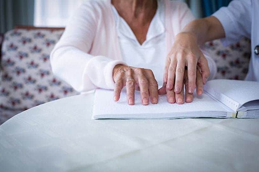
Thus, the majority of the Braille Institute’s 37,000 clients across Southern California don’t depend on the dot-based braille language. Instead, they rely on spoken-word tools and accessibility standards that may encourage text publishers to think more carefully about the legibility of words on pages.
Those standards can help developers build apps and websites that let low-vision users customize their type size, color, background, spacing and other variables, all crucial to readability on smartphones, tablets and computer screens. While these tools can make a big difference with digital materials, magnification is typically the only adjustment option available for text on printed materials like books, fliers and pamphlets.
That may leave even more to think about, especially in the specific shapes that are central to typography. “The shape of the letters is a major component in reading,” says Elliott Scott, lead designer at the design firm. “You want to increase everybody's chances of reading well — and comprehending what they're reading.”
Typeface types, past and present
Typography is as old as the printed word. The typographer may carefully design every arc and segment within each letter, numeral and special character in a written language. For instance, the amount of white space in the letter “o” and the arcs of the letter “m” conform to the typographer’s vision for a typeface. Typefaces are usually designed for visual consistency and aesthetic appeal.
Typefaces typically fall into two categories — serif faces, which have curved accents at the tips of each character, and sans serif faces, which lack these accents (sans means “without” in French).
Examples:
Times New Roman is a traditional serif face.
Arial is a modern sans serif face.
These and thousands of other typefaces may work fine for majority of readers — but maybe not so much for people with low vision.
For example here you can contrast how “Braille Institute” looks in each face:
Braille Institute (Times New Roman)
Braille Institute (Arial)
Here’s the same type in Atkinson Hyperlegible font:
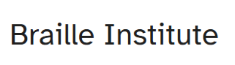
Note the differences: The lower-case “i” has a small tab on the top left, while the lower-case “l” and “t” have a small base curving to the lower right. These visual flourishes are more like serifs in a typeface that’s otherwise designed to look like a sans serif face.
Traditional serif faces like Times New Roman may have some of that character, but the Braille Institute needed a more contemporary typeface like Helvetica because the organization is modernizing for the 21st century, according to the firm.
The challenge for modern, sans serif faces may be that they accept a certain level of ambiguity. For example: When “Illness” is capitalized in Helvetica, the first three letters may look identical. Atkinson Hyperlegible font's small, serif-like flourishes remove these ambiguities.
How to create a new typeface
The firm shared that it faced a unique quandary when it started its rebranding project for the Braille Institute: finding a highly legible typeface. They couldn’t, so they decided to create one.
To create the Atkinson Hyperlegible font, Scott and his colleagues had to craft hundreds of shapes — letters, numerals, punctuation marks and symbols — with the goal of helping a low-vision reader distinguish between each character. For example, a zero had to look different from an uppercase “O” and spacing within a lower-case “c” had to look different from a lower-case “b.”
That was a challenge, according to the firm. In addition to creating the characters, the agency submitted versions to the Braille Institute to get feedback from some of their low-vision clients. That feedback, plus an in-depth study of legibility research, helped the agency develop the typeface.
A typeface for low-vision readers
The creation of Atkinson Hyperlegible font isn’t just to help one nonprofit serve its low-vision community. It’s about bringing accessibility to the wider world and increasing inclusivity, according to the firm.
Atkinson Hyperlegible is already making waves, winning a prominent graphic design award.
The Braille Institute published the typeface on its website, making it available for anybody to download onto their devices. The institute also plans to collect data on the typeface’s effectiveness, hoping to use that data to persuade tech giants to include Atkinson Hyperlegible font on their platforms.
Thus, what started as a local branding effort may one day help low-vision people in Southern California — and perhaps around the globe. As Sandy Shin of the Braille Institute puts it: “This can make a really significant difference in their day-to-day lives.”
Update: A new version from the Braille Institute in 2025. It’s called Atkinson Hyperlegible Next which is an enhanced font with seven weights — light to extrabold, in upright and italic styles.
READ NEXT: How to make the internet easier to navigate with impaired vision